Monday, May 3, 2010

Welcome to the dark side: IE6


http://www.wisdump.com/design/should-designers-stop-supporting-ie6/
Many designers have to make the ultimate decision of whether to support IE6. Randa Clay gives her opinion in

Obviously, there are some conditions under which you could easily drop the hacks:

  • the site’s target audience/customer is tech savvy.
  • your stats tell you that only a small percentage of your audience is still on IE6. Who cares if close to 40% of people are still in the browser dark ages. The only stat that matters is what browser your visitors are using.
  • leaving out the hack isn’t going to disrupt the user experience that much anyway.

As I read the article it brought up some questions in my mind. Do we really want to spend half of the time trying to make your website work for IE6? How many of your users actually use IE6? Is stopping support of IE6 a way to punish those who refuse to upgrade?

Randa Clay concludes that "...it’s just part of the job. We’re not designing web sites for US, we’re designing sites for THEM."

Luckily for the scope of the Dorm Energy Competition project we do not have to support IE6.

Now for the "cool stuff" links:

15 Google Chrome Extensions for People Who Build Websites


Some of my favorites are:
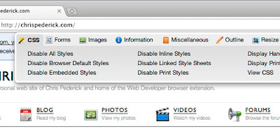
  • Chris Pederick’s Web Developer toolbar (which is also available for Firefox)
  • Webpage Screenshot
  • Resolution Test

Wednesday, April 28, 2010

Art Colleges FTW

I have been looking at different college/university websites to get ideas for a college themed page. The idea is that the themes wont solely be for the University of Hawaii but that other colleges will be able to take the template it make it their "own". Most big named colleges such as Stanford and UCLA have very simple layouts so I went to smaller art college websites and was impressed. They are after all an art school and it definitely shows in the creativity of some of the sites.


UCLA: Although I find it impressive that they are the "national champs", the confetti background seems a little much


Stanford: Very clean (+), plain (+/-)


Corcoran: A good example of a clean simple site that is not considered boring. Good use of color (+)

Tuesday, April 20, 2010

Git-ting on my nerves


The "quickstart" portion of the Git SVN guide


I have used Subversion for most of my projects. However, for this project we are using Git. It took me a bit to understand the concept of Git. I did find a site that has a Git SVN crash course, kind of a "converters" guide to using Git. For commonly used SVN commands the Git equivalent is also given.

I encountered some problems using Git. When I used SVN, I would just do an update and it would get the newest changes. However, when I used Git, if I moved a file to say my desktop and did a pull the file would not get updated. After many trials to fix the problem, George advised me that using the clone command would be the easiest fix.

Git SVN crash course: http://git.or.cz/course/svn.html

Guide to Git: http://linux.yyz.us/git-howto.html

Tuesday, April 13, 2010

CSS: Google-ness

When I think of Google's "style" I think of clean, simple, very minimalist. I think of their colors: white and blue, and their containers with rounded corners.


My version of "Google-ness" applied to the Dorm Energy website.


Before

Header Text Image Replacement


The font used in image1 as the header seemed very bland. I changed the text to an image using the technique told by Chris Coyier. It leaves the text there but out of sight and displays the image. This allows search engine readability while being aesthetically pleasing.


.headerReplacement {
text-indent: -9999px
width: 600px;
height: 100px;
background: url(pathtoyourimage) #cccccc no-repeat; }


http://css-tricks.com/header-text-image-replacement/


after
(with some other changes)

Gradients

I wasted a lot of time messing around with the colors. No matter what color I chose (I like green) it did not look appealing. I realized that all the sites I thought had beautiful colors used gradients. I did not want to manually create an image with a gradient and use it as a background like most tutorials advised me. I found this website that does it for you. It has made my life so much easier ;) .

http://tools.westciv.com/gradients/index-moz.html

Monday, April 5, 2010

CSS: What's your position?

The position property in CSS affects the way elements are positioned on the page.
position: value;

Values:
  • Static: default positioning for all elements
  • Relative: offsets relative to the default positioning
  • Absolute: positions element based on nearest parent element or the corner of the window
  • Fixed: same as absolute except parent element is always the window
http://www.barelyfitz.com/screencast/html-training/css/positioning/ has a simple yet helpful tutorial about positioning. It has great examples for each position.

References:
http://www.cssbasics.com/css-positioning/
http://www.barelyfitz.com/screencast/html-training/css/positioning/

Tuesday, March 30, 2010

CSS: Testing the waters


With a whole new project comes a lot of resources to keep track of. I created a wiki that holds links to websites that I liked, disliked, or just found interesting. I also added a list of links to resources that the CSS group can refer to while working on this project. This wiki will organize the many different links to websites and our thoughts about them.

Some things that I liked about these sites I found were the layout, text, and color. I generally think that simple sites that are easy to use and easy on the eyes are what attracts me the most. I like plain, but not too plain. There needs to be something that catches my eye and draws in my attention. I like colors that match the feel of the page and what the site is trying to convey.


Wiki: link

Monday, March 15, 2010

Remix: Hello, CSS!


Some inspiration: style that is clean, simple, and beautiful to look at


CSS

With the end of mockups and saying goodbye to the Design Group, I have decided to try out something new. I am now a part of the CSS group. While I don't know CSS and have a very basic knowledge of HTML, it is really something that I want to learn. I borrowed a couple of books from the library and I am going through the tutorials on W3Schools.com. I love how W3Schools allows you to "try it out" every step of the way. I usually can read something say from a book and think to myself "oh I got that" or "seems easy enough" but when it comes time to actually use what I read it is a whole other story. I think I just need to sail away from the safe harbor and just jump right in.

Pinax
I am in the process of getting George Lee's Kukui-Cup project running on my computer. The CSS group is working mainly with his project. I initially had problems with permission issues but after emailing George he added me as a collaborator to the project and I was able to download the project. The CSS group is meeting with him tomorrow where I hope to ask him more questions about getting the project running as well as the CSS structures in his system.